Holistic System Monitoring

dashboard showing the health of the entire suite of services

Federal executives wanted to quickly understand the health of their entire suite of services so that they could quickly spot and respond to issues.

Role

Information architecture, visual design, data visualization, user research

Team

Front end developers, back end developers, machine learning engineers, business analysts, product manager, product owner, federal executives

Timeline

Six months

QNOD user groups

CMS executives

Centers for Medicare and Medicaid Services (CMS) is the main user group. The project started as a dashboard for CMS executives to understand the health of the entire CCSQ ecosystem at a glance. These users have packed schedules and do not necessarily have the time to participate in user research on their own. We have had the most success getting feedback from CMS through group meetings where we shared design concepts.

Application developers

Application developers also use QNOD although not as much as CMS. These users mostly use QNOD to share the state of their service with CMS since they typically use their own tools such as New Relic or Splunk to monitor their service directly. We had the most success getting feedback from ADOs when working with customer service managers who have relationships with them and by working with CMS to include QNOD feedback tasks on teams’ respective Jira boards during PI planning. 

Research phase

View of one of the concepts showing how the services were related to each other

Navigation

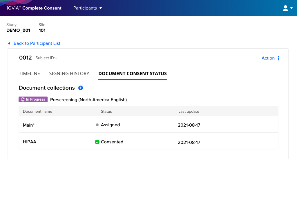
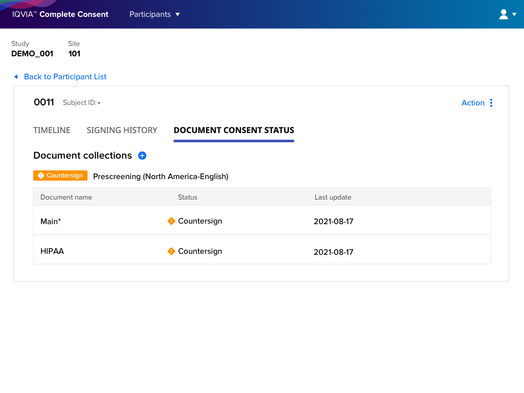
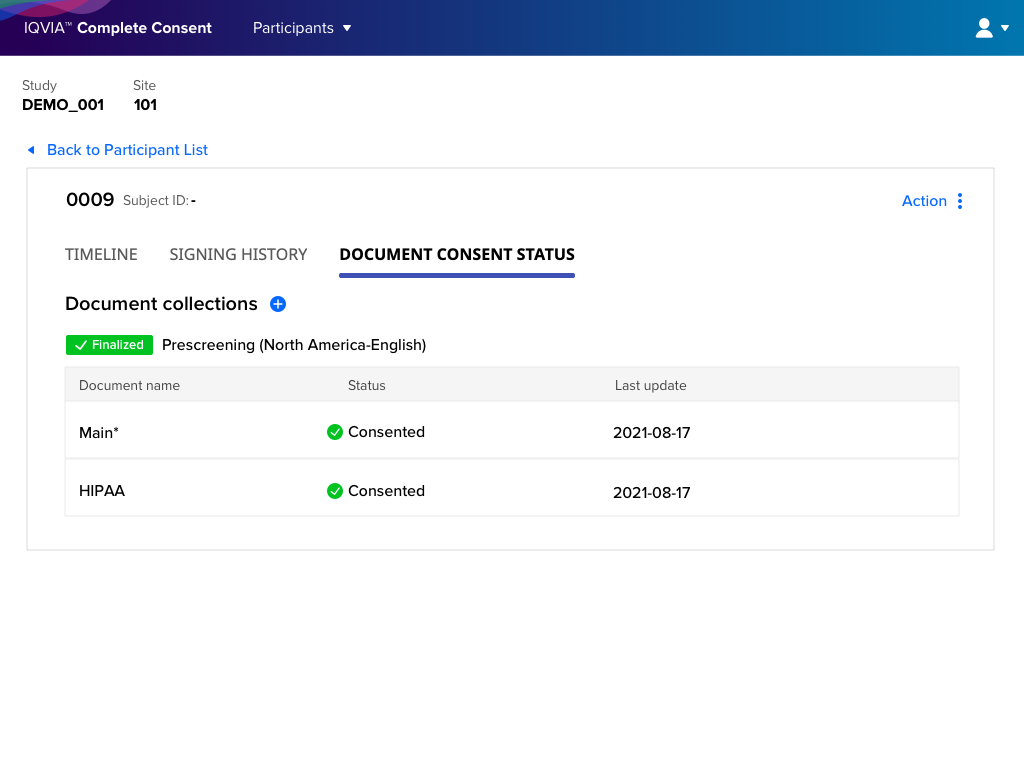
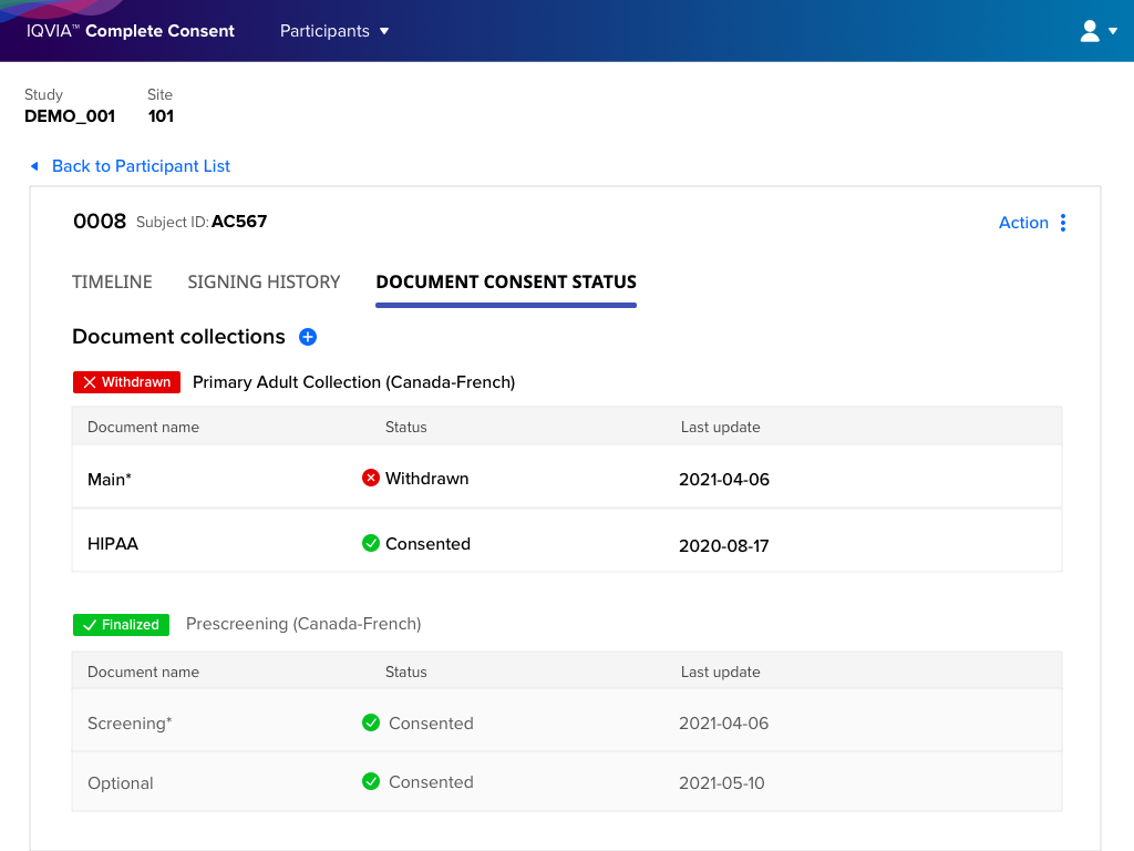
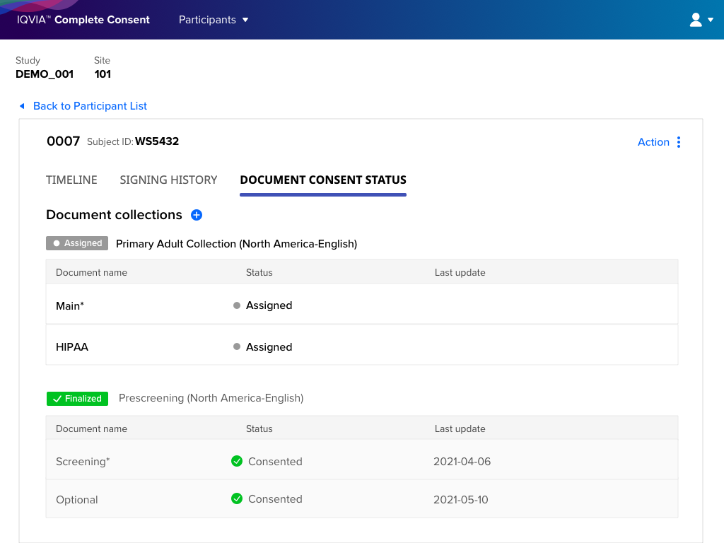
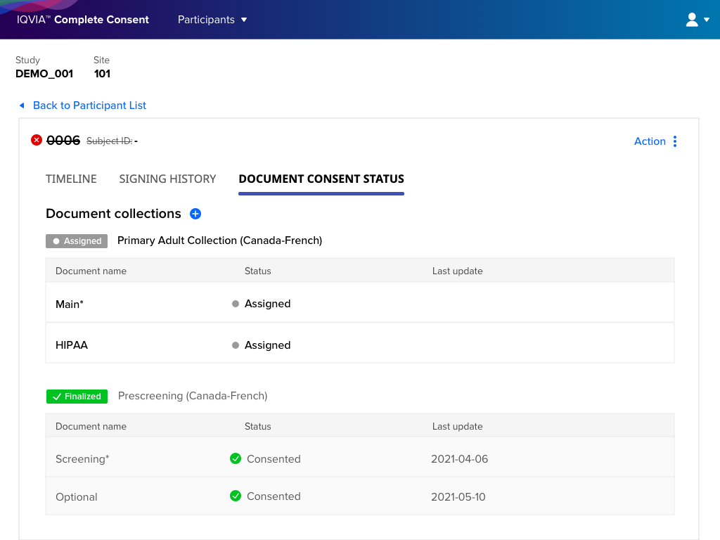
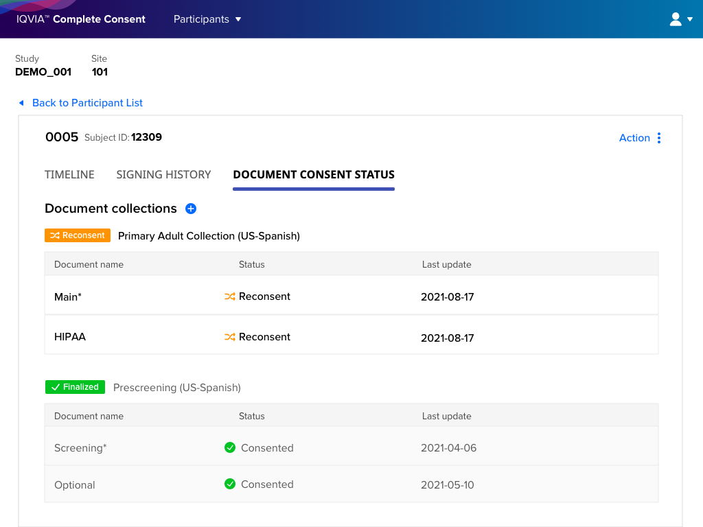
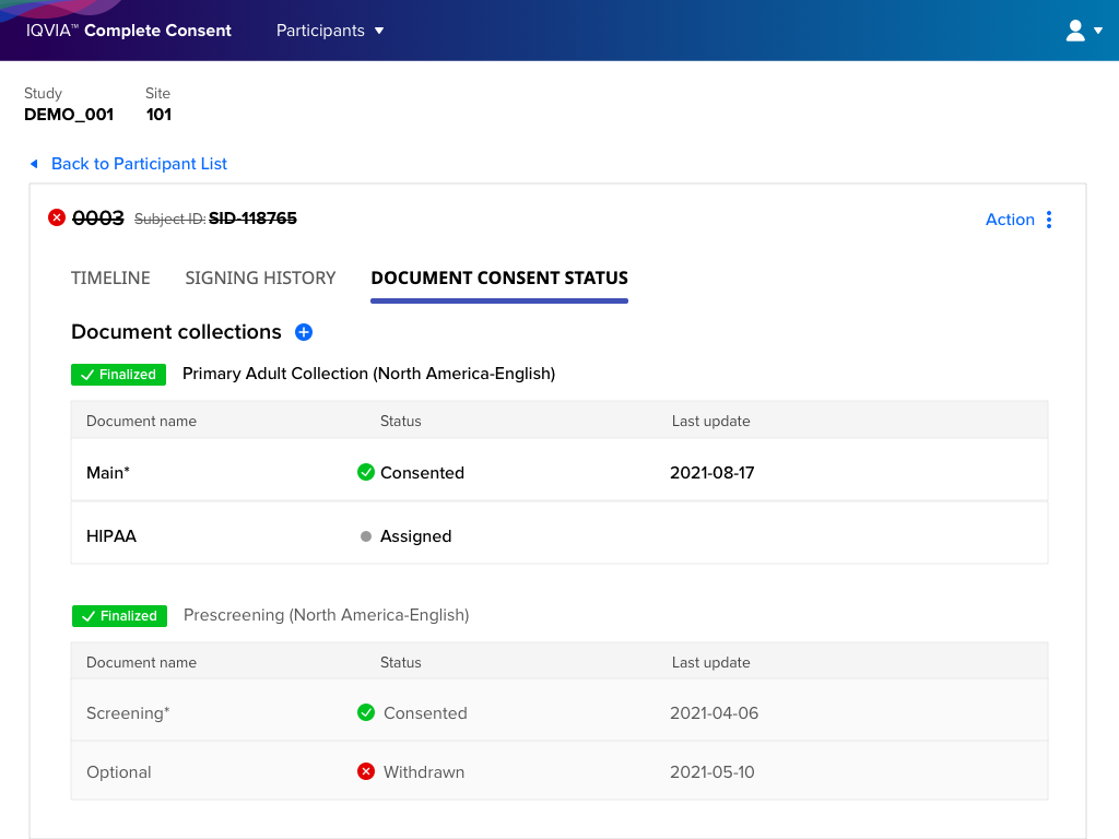
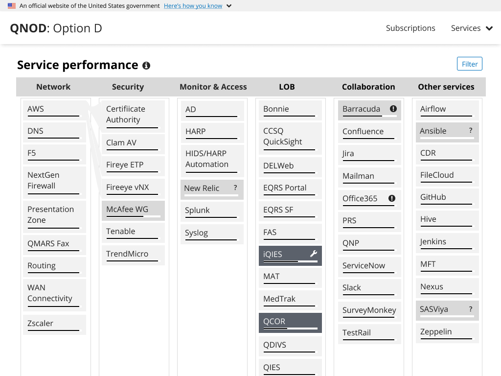
The logo takes you back to the main page with information about the entire CCSQ landscape. The About page gives information about QNOD, answers about metrics and a glossary of terms. The Profile page shows you what capabilities you have in QNOD and lets you manage your alert subscriptions. The Services menu item opens a list of all services. Clicking on the “i” icon next to a title provides additional details.

dashboard showing the health of the entire suite of services
Overview of the health of the entire CCSQ ecosystem at a glance

Tiles

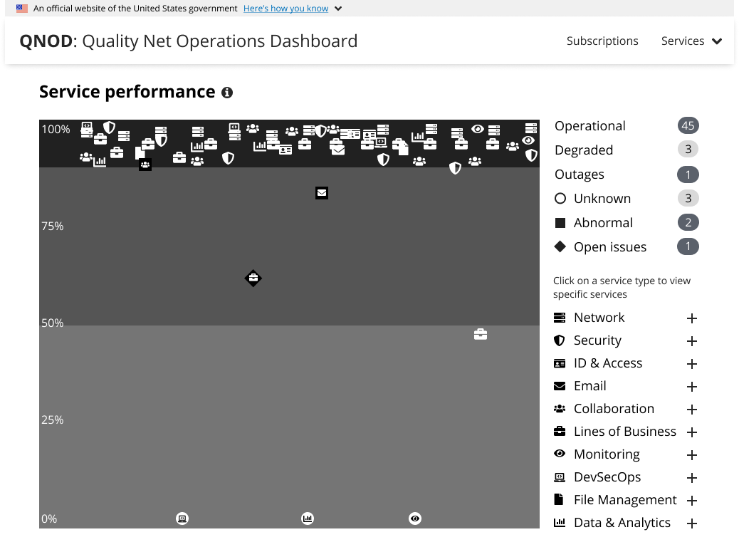
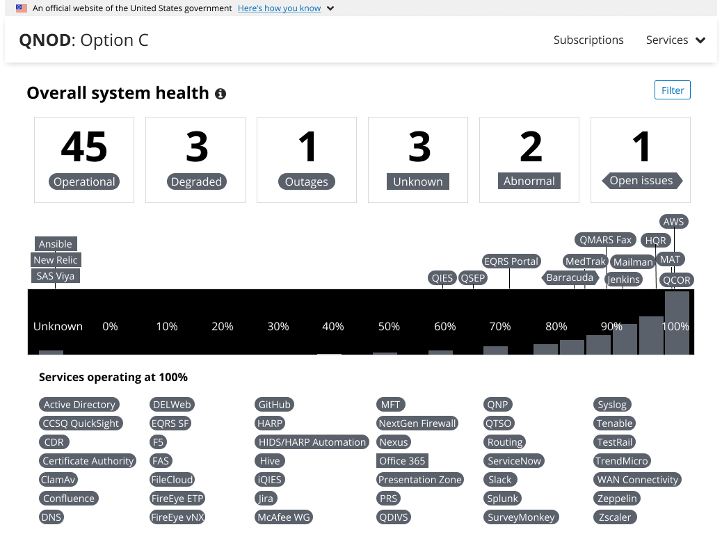
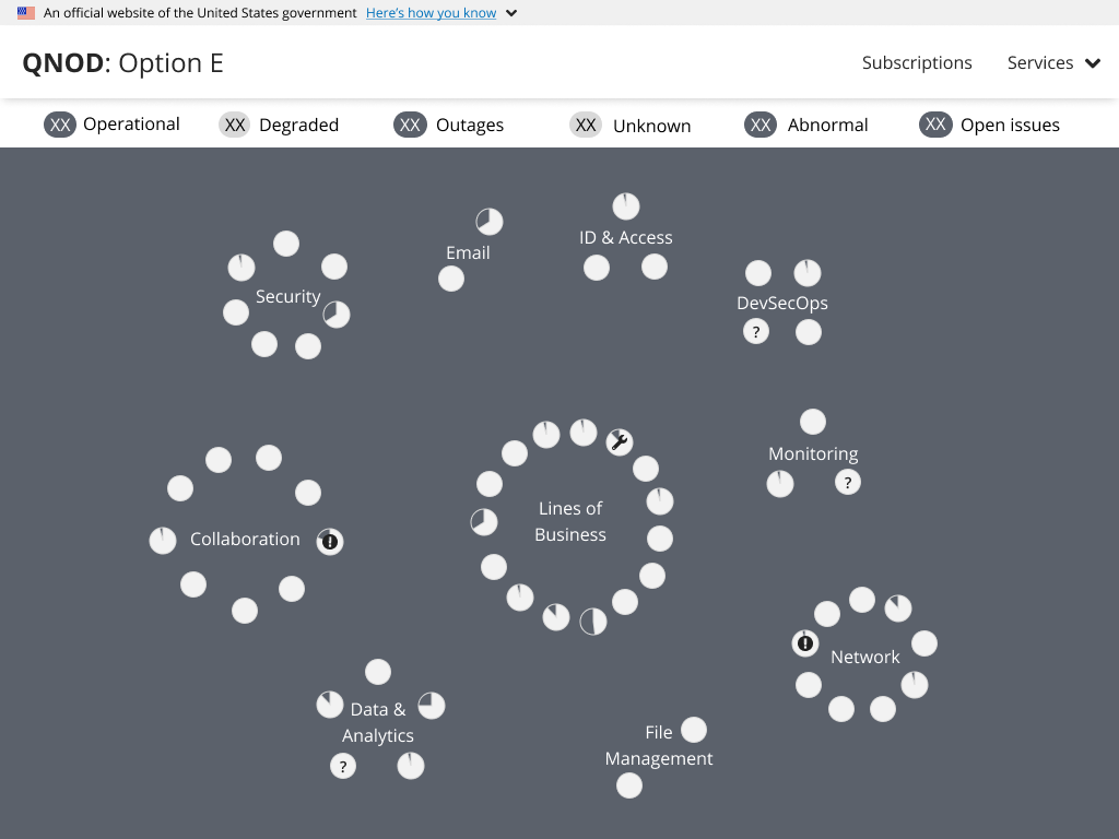
The tiles at the top of the page show how many services fall under each category.

Operational is any service with a health percentage above 65%.

Degraded is a service less than 65% and more than 50%. These services may not be working as well as expected. There could be long load times and system delays.

Outages are services that cannot be used at all. These services have a health percentage of less than 50%.

Unknown means that QNOD is not receiving enough information about the service to determine the health percentage. This situation occurs when the KPI connections used to calculate the health have not received data from the monitoring service. These services could be operating as normal or they could be down.

Abnormal means that QNOD received values significantly different than usual for those services, also known as an anomaly. The reported values could have been better than usual. This does not change the health calculation. A service could be operational and abnormal at the same time.

The numbers in the tiles can add up to more than the number of services because “Open Issues” and “Abnormal” are additional details about a service.

Service spread

This graph shows the overall view of the CCSQ landscape. The color of each service matches the color of its health category. A service with a rounded shape means that it doesn’t have any reported anomalies or Jira issues. A service that is “Abnormal” will have a rectangular shape; a service with “Open issues” will have a diamond shape.

Services are located in order of their health percentage using the values in the histogram chart below starting with “Unknown”. Services with lower health percentages appear further to the left; services with higher health percentages appear further to the right. Services with perfect health scores appear in the accordion below the histogram.

The histogram shows the number of services within each range. Ideally, more services will appear on the right side of the chart than the left. The range of values starts with the current lowest available value for any service. This means that the values in the chart may start at a higher percentage than expected and will change depending on the current services’ health percentages.

Accordion

Any service that is operating at 100% health are displayed in this section in alphabetical order. This section can be collapsed and expanded.

Tiles

Health is the current health percentage for the service. This number is calculated from all the KPI reporting into the service.

Availability shows the percentage of time that the service was working over the past 30 days. Any time that the service had an outage is used to calculate this number.

Days Up is the number of days since a service last had an outage whether that outage was unplanned or expected maintenance.

Anomalies shows how many times that a service had abnormal values reported over the past 24 hours.

KPI connections shows the number of queries to monitoring services.

Open issues is the number of open Jira stories related to service issues.

Health composite

This chart shows the trend of service’s health through the categories that make up the health: synthetics, application, compute and network. Each bar has a maximum value of 100. Each segment of the bar shows how each category contributes to the overall health.  

Anomalies

This chart shows the length of time and when anomalies occurred during the past 24 hours in gold.

KPI connections

These show which monitoring sources are used by each KPI. Each KPI also shows the last time the feed was received and how frequently the feed is scheduled to update.

Open issues

Each open Jira is listed with a link to the Jira story, the ID of the story, a short description and its status.

Profile page

The profile page shows users their role in QNOD and allows them to manage their site preferences. For the initial version, users will be able to customize service alerts based on KPI thresholds and timing. In the future, users could set favorite services, change color schemes or choose different views.

Results

Ability to see health of the entire suite at a single glance

Multiple levels of detail for different users

Consent Management

Complex clinical studies can include different consent statuses at different stages of a study as well as for different participants that clinical research coordinators need to manage. The existing legacy application needed features to make managing these complex trials easier.


Role

User flows, user research, information architecture, user interface

Team

Product manager, business analyst, product owner, operations managers, multiple development teams

Audience

Clinical trials coordinators need to keep track of participant consent in multiple studies. Coordinators are very busy and using many different applications to run a clinical trial. The consent part of a trial is only one part rather than a frequent task so coordinators do not use a consent application often enough to become very familiar with it.

Diagram showing how document collections affect participant status

Adding vital features to a legacy application

IQVIA had an existing legacy application that sponsors could use to keep track of participant consent in simple studies. However, the process was difficult to manage for more complex trials. Studies can include different documents for different participants as well as different stages of the trial. Trials can be on-site, remote or hybrid. Participants need to read and truly understand what is expected of them before they agree to participate in a trial since some of the trial requirements can be invasive. Coordinators will want to quickly answer questions that a participant has about the trial while not standing over the participant’s shoulder as they read. The Readalong solution helps save the coordinator time since they can let multiple participants sign at the same time.

Results

Initiated a customer advisory board with support from division director

Clinical Research Website

Most clinical research organizations market their clinical trials to doctors. IQVIA also reaches out directly to potential participants through advertising campaigns and dedicated websites.

Audience

Patients and caregivers searching for treatment options

Healthy people interested in paid research

People responding to ads looking for clinical trial participants

Role

Information architecture | User flows | Content strategy | Visual design | Interaction design

Proposed user flow for revised site

The existing ClinicalResearch.com website has a lot of articles about health. However, from reviewing the Google Analytics data, people visiting the site are not interested in reading these articles. They want to find a clinical trial. The search functionality on the site did not make it clear which trials were most relevant for the patient. Patients could not choose to expand their search beyond 300 miles. Interviews done by the research team uncovered that some patients were willing to travel across the country to get treatment. People wanted to be able to keep track of their health and the health of the people they are taking care of.

Later research done by a separate group uncovered the same finding: potential participants want to save their information and come back to it later. Patients also want to know that they are sharing their information with a trustworthy source.

Wireflow for account creation

Profiles

We created a profile completeness metric to encourage people to add more information to their profile. If we had asked for all of their details when they created an account, they would have been more likely to abandon the process completely. Most people were coming to the site through mobile devices so we prioritized the mobile design.

Desktop view of profile immediately after account creation
Abbreviated health condition template option

Results

Focus on clinical trials instead of generic health articles
Ability to save information about their health
Recommendations for relevant clinical trials

Oncology Patient Portal

To find out how their new chemotherapy treatment would affect patients’ everyday lives, a pharmaceutical company decided to run an observational study. 

Audience

Patients with a late-stage cancer most common in men over 60

Site staff working on the clinical trial

Role

Information architecture, visual design, data visualization, content strategy


I collaborated with the digital strategy team, clinical team, and sponsor to come up with the basic needs for the site. Patients needed a dashboard to see their overall study progress, information about the study, resources about their cancer, how to guides, and information about the questionnaires.

Whiteboarding the user flow

I worked closely with our medical writers to shape the content for the wireframes. We separated the information about the questionnaires into smaller chunks so patients could easily see what a section was about and how long it would take to complete. Many of the questionnaires have official names that make more sense to clinicians than to laypeople. Because each questionnaire included many questions, we included a motivational message every time the patient completed a section. 

We received feedback from the sponsor’s patient advocacy board that the dashboard had too much information given about the study overall. They wanted to know where they were today, not where they were in the study. I streamlined the dashboard and the process to start the questionnaire so patients could skip directly to the questionnaire if they wanted.

Revised dashboard showing a partially completed questionnaire

The sponsor wanted to share visualizations with the patients to show them the impact of their participation. These visualizations went through several iterations before we decided on a simpler graph with more information about each graph.

Results

Patients could complete questionnaires by themselves
Investigators gained deeper insights into study participants
Positive feedback from the sponsor and their patient advocates

AKC Event Search

Dog show participants were using competitors’ sites to search for dog shows even though American Kennel Club is the dog show authority because they found the AKC site too difficult to use.

Role

User Research | Information Architecture | User Flows | User Testing | Visual Design | Interaction Design

Audience

Owners, breeders, and professional handlers interested in events where their dogs are most likely to win

Participants looking for information about past show results

Clubs and superintendents holding events who want to be sure their event info is correct


I read anything I could find about dog shows and spoke with several subject matter experts. I compared the site my interviewees told me about and the site I discovered from reading online dog show forums to the AKC event search. I reviewed Google Analytics data and Hotjar heatmaps, and watched site recordings to see how people were using the existing site.

Heatmap of the original search

I still had questions about how participants thought about their searches so I created surveys to ask questions of current users.

I sketched concepts for layout and flow and collaborated with developers to understand the technical feasibility. I recruited testers from survey participants and validated my wireframes with interested survey participants.

Event Search Wireframe
Revised search allowing for multiple competition types at the same time
Summary of the search results with option to revise the search criteria without needing to start a new search
Option to revise search

Results

Search for multiple competition types at the same time
Breed-specific search for all events instead of just conformation (the classic dog show)
Mobile-friendly design
Capable of more targeted searches
User-friendly even to non-technical users